Friday, June 1, 2012

Jeff Koons - Mastery artist


            With this installment, I wanted to mention a piece by Jeff Koons called the “Pink Panther”1988.  It is a sculpture roughly forty inches high and is of a pinup model embracing a pink panther cartoon character.  The sculpture is made of porcelain and well crafted.  Being a porcelain sculptor myself, I can see the extreme challenges that this faced in order to be intact and be a successful art piece.   The colors are pastels and soft to the eye.  This I’m sure was done with intent as to make it look cartoonish and less realistic.  The female in the piece has a big smile and with one arm embracing the pink panther and the other covering a bare breast she has exposed.    The detail is well done and the finish is glossy.   There are many opinions on this piece particularly.  The woman is seen by many to be Jayne Mansfield and the embrace symbolizes a certain masculinity that men today need more of. 

            The “Pink Panther” caught my attention because it was so disrespected in my opinion by the Stokstad text.  The author rips this piece pretty good saying that Koons’ art and especially this piece as being “openly materialistic and shallow, positively wallowing in popular culture”.  It also says that Koons enjoys the negativity and disapproval.  I think it is interesting that this has such a large negative connotation to it.  In the times that we are in, art is a form of expression of the times and societal ills that effect us.   Sounds like perhaps Stokstad is defining Koons as a avant-gardist.
         Here is a little history on Jeff Koons.  He was born in 1955 in York, Pennsylvania and currently resides in New York, NY.  He studied at the Art Instute of Chicago and received a BFA from Maryland Institute College of Art.   He later worked in a museum of art as he molded his craft of sculpture and painted many pieces.
          Jeff Koons is a great sculptor in my opinion because he excels at creating very difficult sculpture using some very tempermental mediums.  Not all are fragile, but  I enjoy his outlook on the world 
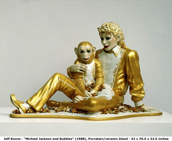
around us and pictured here are a few of his other pieces. 


          I think his societal commentary is hilarious.... For example...

         He dabbles in shock value and takes the simple and makes it abstract enough to be seen as an extension of thought.  The majority of his work includes some amazing colors, brilliant and piercing objects that eject toward you as you look at them, especially some of the folded balloon pieces of varying reflective colors. 

        Some of his work is on the pornographic/elicit side and reference beautiful women engaged with stuffed animals and other objects.   He was married to an ex porn star, so that may explain that one.   Some of his work is loved and other bits are hated because of their offensive nature.  It is an interesting factoid that there is a video game where you can destroy Jeff Koons artwork.  Sounds like technology is catching up to the societal majority outlook of his work.  What I respect most in his work is that he has been quoted many times saying “There is absolutely no hidden meaning or agenda in my work”.  So if anyone says there is, it is obviously the thoughts of the viewer and their outlook on life changes how the work has been seen.  I think he revels in the fact that he is removed from any political discussion of his work, and that leaves him to only worry about being honest with himself and forget about what anyone else may think.

            An artist who I find impressive is Robert Smithson.  He is considered to be a minimalist installation artist, although he did produce some other work in abstract expression.  The majority of his work encompasses reflective surfaces and rock or some substrate of earth.  


             As a child he was enamored with nature and was quickly thrown in the art world with a scholarship to Art Students League in New York.  There he became a proponent of abstract art and did many paintings.

              He later married a minimalist artist who was a sculptor and he became very interested in that style.   Part of his ideals was to create an art project in nature and have it be consumed by nature.  In other words, he wanted nature to have its way with his projects.   He also styled in taking photos of landscapes and surroundings, then enlarging the photograph and then reinstalling the enlargement into the landscape.  He then would photograph the photograph within the landscape giving a sense of one referencing the other.  Robert Smithson lived from 1938-1973.  He died in an airplane crash while working on his latest project called “Amarillo Ramp” which was under survey for construction in Amarillo, TX. 
My focus today is an incredible piece of art and work for that matter known as “Spiral Jetty” by Robert Smithson 1970.  

This is Robert’s most notable work of art.  This particular piece is a fine example of “earthwork”, as it is made up of mud, precipitated salt crystals, rocks and water.  The incredible structure is more than 1500 feet long in a spiral and the walls of the structure are fifteen feet in width.  Separating the spiral walls is water from Great Salt Lake in Utah, USA.  Robert saw the lake as a productive ocean killed by the Dead Sea.   This thought by Smithson, I believe had some reference to biblical plagues and death from a “God” event.   The spiral design of his mammoth sculpture was taken from the primitive use of spirals throughout many cultures.  The spiral design also appears in nature and can be seen in natural events (water storms) as well as in the biology of many creatures.
I find it very interesting how the color of the water changes as you get closer to the center of the spiral.   The enormity of the project is also very striking.  This was not something done and a few days, this was well thought out and executed with great precision.  I researched and was unable to find any of the chemistry or ecology factors that the spiral has changed.  Is the concentration of salt greater at the center of the spiral or is it less.  Might this be some technique that could be used to reduce or increase the salinity level of a watershed?   There are all kinds of questions, but one interesting thought is how the timeline of his death may have affected his work.  The rise of the environmentalist laws and regulations didn’t really start till 1973 with President Nixon.  If Smithson were alive today, would he be ridiculed for disrupting the environment, when all he was really after was showcasing how constructive and destructive forces with affect nature.  Perhaps the environmental movement would have shut down his future large scale natural art projects or may have demanded that the “Spiral Jetty” be removed for its impact at the Great Salt Lake.  Again, we see the politics of the day and art closely wound together,  as we have learned throughout our class. 

Wednesday, May 30, 2012

Rik Shifty Art Design


This week we look at quick glimpse at some of my recent art pieces.  I enjoy creating clay sculptures and painting visions in my head or transposing a photograph to canvas, while modifying it to my liking.  I also have a passion for ink art whether in the form of abstraction, detailed drawings or fanciful designs.  The art influence that I see in the majority of my work would be somewhere between realism and impressionism.     I say realism because I enjoy nature and recreating it in some media, with the express intent to make it as real as I am capable of making it.  In respect to Impressionism, this comes from the use of bright colors and my interpretation of the light and what I see in the picture of my mind.   I tend to paint the shimmers of light or recreate what my camera eye caught; similar to Claude Monet where he captured the light in small spaces and creates a beautiful picture like “On the Bank of the Sienne, Bennecort”.   This is one of the paintings I am most proud of…I call it “Amante di Acqua”, Italian for “Lover of Water”.  It is approximately 60”x34” and framed with two pieces of drift wood I found and cured over a couple of winters.  This is probably my best work that still survives to this day. 

The second piece I will show you was never titled.  I had it finished and it did not survive delivery day.  This piece was a huge time investment and it was shattered on route to the art show.  

I put approximately 40 hours into the wing itself.  Made of porcelain, and very fragile, I carefully carved out the porcelain on both sides; extravagant feathers on one side and the other side photographed.  This photo is the only proof that it existed and I wish I had more.  This was the masterpiece to date for me and ……..I just teared up…….hold on……….ok…  Back to it.
Many works of art have been made by my hands, but very few will I share with anyone.  They all have a special place to me, and of course the fact that I am my most qualified critic, I want to make sure that whatever has my name attached to it be just what I intended it to be.   I usually look back on a piece and say that really is missing something.  I shelve it and maybe come back to it later (months).  I think I approach the definition of OCD sometimes and I get completely immersed in a project, and if it isn’t turning out, I immediately forget and throw all my other eggs in the new basket for awhile.  The work that Central has seen, has been completely uninspired; which is of no one’s doing, I have just had my primary focus other places, and operating within a deadline is difficult for me sometimes.  If I feel inspired I can whip something up in a day, but otherwise months might go by.  Can you really call it “art” if you are forced to come up with something?  It may look like art but it certainly won’t have much extrinsic meaning.   
My mother was quite the artist, so sometimes I wonder if there is a genetic piece that has transferred on.  Like other abilities passed to children, perhaps art aptitude is as well.

Wednesday, May 23, 2012

Inspired by Roy Lichtenstein


        In this installment, I wanted to bring one of my favorite artists to the limelight.  Artist Roy Lichtenstein (1923 – 1997).  His early work sprang from caricatures of artists and famous celebrities in motion or doing some task as well as abstractions of Western motifes.  The popular majority of his work is contrived from comic strips popular in the US since the 1950’s among youth.  He has a very certain style and that style is still wildly popular today.  He considered his art to be “Industrial Art”, and there appears to be many followers.  Many of his works seem simple in design, but offer the viewer a fun look at the contemporary world through the panes of comic strip boxes.  There is a stipple design called Ben-day dots that are seen in most of his paintings.  They play on the printing techniques used in newspapers and in many low resolution printings.  Throughout his collection, you will see women crying, embraced, or involved in some sort of dramatic situation, as well as parodies on advertising and the ideas of the day, which include some timely humor.  For example, he has a piece called “Portrait of a Duck” 1989, where we see a Disney figure of Donald Duck with dollar signs in the eyes and evoking from the head; by this, he seems to be making fun of the Disney Corporation and perhaps the greed associated with it.

       The focus piece today is “Kiss V” 1964 by Roy Lichtenstein.  The original piece is a drawing that was later turned into screen print and painted.  It has been duplicated and rendered in many different styles also.  This is an image of a man and woman embracing in a kiss.  It is a colorful piece and really stands out.  The man is wearing a blue shirt/sport coat, and the woman is all primped up in perfect 60’s form and a tear is being shed, as they embrace tightly and kiss.  “Kiss V” include the Ben-day dots and is compositionally very balanced, with focal points in the lips, eyes, and hair.  Critics say that this is a purely satirical look at the traditional roles of male and female in the 1960’s.  Maybe seen as a woman forcibly holding her man as if he were the only way for her to feel comfort, or that she is needing of comfort from a long day of grooming and making the house ready for the return of her man.  The tear she sheds for emotion as if all women are overly emotional, fragile and incapable of rational thought.  I think that people and critics really make too much of this piece of art.  I simply see a lonely woman who is happy enough to cry that she is after however long in time, finally in the embrace of her man and even throw in a kiss to make the moment even brighter.
Original Drawing
Replicated Piece

              I've found it is also interesting which way this work is laid out, woman above or man above.  By simply rotating the canvas you can maybe make different realizations of the intended meaning.   I really believe this to be a question of are you a pessimist or optimist?  If you are an optimist I think you see a happy situation, one that is bringing two people closer together, and if you are a pessimist, than you see this art as a travesty and intentional slight on humanity and society as a whole.  Some may say it requires more effort to be pessimistic, but I think it requires just as much thought to be positive.  And perhaps you can gain a smile.  
           That smile was most certainly attained as the original drawing in graphite and crayon, “Kiss V” was sold at Christie’s auction house New York in 2011, for $2,098,500.  I find it important to mention that the drawing was 6” x 6”, thus raising over $58,000 per square inch of paper.  That dollar figure doubled the estimates, and the previous owner received one of the heaviest grossing payouts for a drawing (per square inch) in history.    

Wednesday, May 2, 2012

Week 6


This week, we are looking at the “Blue Nude” by Henri Matisse, 1907.  In this painting there is a strong presence of primitivism and a sense of avant-garde.   First reaction to this painting was of initial shock at the color choices, so bold and in your face.  Then, secondly the nude figure seems to be right in your face as well.  As if zooming in on the nude was necessary for reaction.  Analyzing this, I see that this nude in comparison to older works and the “common nude” are very bold and out there.  Being honest with myself, I am not sure whether this is a male or female.  Of course the breasts are large and in your face, but the masculinity of the arms and hair and the covering of lower region kind of leave me a little confused.  There is very little detailed attention spent on the body and I think this was intentional to raise this question.  The nude also has a very muscular physique which promotes the confusion.  Female nudes otherwise were portrayed as soft and voluptuous, not hard and chiseled.  Perhaps, it was painting unisex on purpose to push the boundaries with the critiques at the time.  At first, I didn’t find this painting to be very awe inspiring.  It seems so simple that any “primitive” child could create it.  But after looking further on this painting, there are many hidden ideas.      
            In regard to the primitivism that the painting holds, Matisse paints with broad strokes and very little details.  The nude being surrounded by a jungle of sorts shows that this has a jungle roots idea, that we came from the jungle and this is a return in some fashion our roots.  There is also the idea that in primitivism, females are generally depicted as primitive, working in the fields or being put in nature settings to show their status.  Matisse’s “Blue Nude” follows this critique and also exemplifies another.  The apparent connection to simplicity and disconnection to complexity.  My thoughts here directly correlate to the works by Gauguin.  The majority of what I have seen by Gauguin lacks any detail, seems to be nearly finger paintings, but the ideas and concepts within them are definitely present.  The “Blue Nude” is also very subjective.  I believe this work by Matisse exaggerates and distorts lines, colors, and forms to be more subjective.  It leaves the viewer to decide on his own what he sees.  I think that this was done to be thought provoking and a cause for uproar of emotion and discussions at the well (water cooler of the time).   This nude to me is not considered as an object at all, but rather as a statement of something.  I’m not too sure what that statement is, but it is definitely not the “in the box” style.   And as I recall, this is a definition of what it is to be avant-garde.  To me, the political statement isn’t too clear, but the pushing forward into new envelopes of societal and artistic acceptance is there.  

Wednesday, April 25, 2012


Throughout the majority of Caillebotte’s paintings, there is an impressionist influence and they have modernity. Being from a wealthy family allowed Caillebotte to be progressive and paint to his liking. He is labeled as an impressionist, but throughout his work, he did not follow all the conventions of the impressionist. In his life, Caillebotte suffered enormous loss that left him feeling isolated and alone. This theme is represented in his paintings. They show scenes of isolation and tension with quiet suffering from those within. From people walking in Paris streets assumeably just passing from point A to point B without any care for the surroundings to workers suffering work and maximum effort while feeling isolated. This isolation is however depicted in a time where the rebuilding of Paris is happening and the modernity of actions by the subjects. As exampled by the “Nude on a Couch”, 1882, the figure of a nude woman slung out over a couch appears to be crying or suffering in some way. The placement of the arm over her breast I believe was an attempt to not be completely obscene. An argument can be made that this was a voyeuristic look at someone, where I would contend, that the woman is nude because Caillebotte wanted to show complete exposure. As if the being exposed reflected the complete unhidden suffering of being alone, even in the nice apartment/home on fine furniture. I see the fine furniture as a symbol that this woman is successful and even she still is isolated and alone in her modern, upper class surroundings. In other paintings, Caillebotte shows certain genders performing tasks and other duties that were thought of as only for a woman or man. He was pushing the envelope in the sense of what was known and accepted. His paintings depict the regular man and do not glorify any of the subjects leaving the absence of idealization. Caillebotte uses perspective to further add drama and tension to his works, as well as making sure he pointed out the modern lifestyle and what was expected and encountered by the modern man. He was more focused on changing the ideas and hearts of those who viewed his paintings. So much so that he hosted several impressionist shows and until his death in 1894. He pushed for the acceptance from the academy of paintings by other artists in the impressionist movement.

I believe that Caillebotte's paintings were a critique on the life of modern man. I believe he depicted most his subjects in their current situation and the hard work that all had to make to be valued in the society. I think that he suffered greatly and was having family issues and with the money he had, I think that he may have been pulled greatly by the societal leaders. This however had advantages as having money gave him influence and that helped him push forth modernity and impressionism. Even if it was only after his death, the fact that he pushed for the acceptance of others and their station in life, shows me that he is the definition of what we consider modernity.

Wednesday, April 18, 2012

Kevin Anderson - Manet & Monet


The painting by Claude Monet named “The Rue Montorgueil” and “The Rue Mosnier with Flags” by Manet is two paintings of the French Festival in 1878.  Both these paintings are similar in that they are painted with impressionist motives.  Both are covered with rough brushstrokes and have the use of bright colors.  Both these paintings are works of avant-garde and both are not as simple as they seem.  The subjects of both of them are very political and the colors in each are used to tell the story.

  The “Rue Montorgueil” by Monet is very rough with brushstrokes and it is more difficult to make out what the subject matter is.  The painting is of a crowded street lined with tall buildings with many French colored flags being flown from the windows.  This is a picture of celebration, as if a party has lasted for weeks and the streets are still alive.  The colors used in this painting are bright and colorful and the balance of color and depth achieved from perspective are quite extraordinary.  At a glance you see a colorful mess and when you stop and look at it deeply, you see all the details start jumping out.    The “Rue Montorgueil” is less avant garde in my opinion, because this painting is a picture of French pride and celebration.  It doesn’t offer any disparaging commentary on the current day’s politics.  

In contrast however, is the “Rue Mosnier” by Manet.  The avant gardism is apparent with the subject matter.  It shows a lessened importance on the celebratory and it clearly magnifies the position of a one legged man, assumed to be a war veteran, making his way to work.  What kind of life is it to have to work after so much sacrifice has been given.   I’m sure this painting was made to be a negative commentary on celebrating  continued work and meager means.  The “Rue Mosnier” is much more subtle in color, with much of it being simple earth tones and far less bright colors.  The colors are still there, just they are off to the side and are not a focal point to the piece.  The colorful flags seem to just be a marker in time so the viewer can related when this picture was captured.  It is littered with subjects and focal points that show life as usual happening.  Nothing more.  This to me is an intended slight on the people in charge letting them know that even though the flags fly, the people at the bottom don’t get any treatment for their sacrifice. 

Both these paintings move me and spark emotions both for a positive future as with the “Rue Montorgueil” by Monet, and for the negative as if nothing will change in the “Rue Mosnier” by Manet.  As they are so alike in style and size, they are vastly different if you take your political look at them.  One is of the big party and the other is the behind the scenes look.  I suppose there is the option that Manet painting his as a look at normal life, where perhaps Monet was grandiose and sought out something glorious to depict in his painting.

Wednesday, April 11, 2012

Impressionist Post 3 Kevin Anderson


Of the impressionist paintings available to be chosen, the one painting that resonated with me most was Gustave Caillebotte’s “Paris Street, Rainy Day”.  This is a scene of a busy street being traveled on from many angles. Caillebotte’s use of lines and color are extraordinary.  He has masterfully used the impressionist method of painting blocks of light and color to acquire his personal impression of the scene in front of him.  There is some time spent in detail, so I would not classify this as strictly impressionistic, but also would have to include some realism was having influence on Caillebotte.  When I see this painting I get a charge of renew, a sense of “a new day coming”.  There is a sense that we are all moving in different directions headed to our sunlight spot in the world.  
                Our text does not go into great detail about the painting, but what I see are a wide variety of lateral lines that seem to tilt the picture to the side, as exampled by the cobblestone road aligning to the three walkers on the right and beyond.  I can see three vanishing points being used to bring a wide variety of depth to this scene.  One such line is located to the left of the left-centered building at street level, and another is to the right of the same building, again at street level just to the right of the lamppost.   The third point is somewhere off to the right a ways away from the canvas.  The cobblestone street is drawn from that vanishing point.  The strictly vertical lamppost brings the viewer back into balance and gives the viewer something to “hold on to” while the rest of the painting seems to be sliding off to the right.  There is a certain line orientation that is discombobulated between the lines on the street, the unseen lines and the line of sight that each subject is using.  This appears to be that this painting is moving in many directions all at once.   The use of these lines in itself pushes this painting towards realism.  Further can be taken into account if you have the subject matter in the discussion.
                When looking at the colors offered in this painting, they are bright at the right side of the painting and rather drab otherwise.  I believe this was done to bring a certain amount of balance from bright to drab, right to left.  There are only a few sections of bright color scattered throughout the rest of the painting.  There is a large amount of earth tone color in the brick and a much flatter sidewalk area where the walkers stroll on the right hand side.  There is a large amount of muted light throughout the left side of the painting and above in the sky.  There is also a great study of reflection on the street and walkways. The light and dark sections of each subject are well done.  With such a high concentration of the bright orange to the right, it lends one to wonder if the road to the right is much brighter and shinier than the current one being rained on.  As I analyze the shadows in this painting by Caillebotte, I notice that they are headed in different directions.  Especially when you take a close look at the umbrellas and walkers shadows.  I take this to imply that perhaps “light” shines in all directions….are you willing to see the light or be mired in the rain?
                The brushstrokes seem very broad and rough toward the foreground, and in the background they are less broad and more detailed.  More detail as noted by the almost perfect looking windows and iron work on the buildings.  There is also a certain array of shapes in the painting as well.  I see lots of linear lines as well as oval based subject matter throughout it.  For example, there is an oval look to the street and deviated ovals in the umbrellas throughout.  A “world of ovals and round existing amongst the lines of formality”.
  The sheer size of the painting tells me that the artist wanted you to stand in front of this painting and feel you could take 3 steps into it.  The capture of the lighting and muted sky really lend to the feeling of a new day with multiple ways of getting to where you want to go.  My resonance with this art piece comes from a memory from years ago, and that in itself has me wanting to run into this painting figuretively.

Wednesday, April 4, 2012

Kevin Anderson Post 2


The realism in Gustave Courbet’s paintings were offensive to the bourgeoisie due to the paintings glorifying the plight of the poorer man.  In respect to “The Stonebreakers”, Courbet epicted an old man with the lowest of clothing (torn vest) and clogs, working to break large rocks into smaller ones for a road with a relatively small hammer that looks like it might take all day to finish very little.  The book mentions that the man is knelt and in agony of some sort.  Not quite in my opinion.  I see the man’s knee on a bushel of grass and he has found a way to be as comfortable as possible while still having to maintain work in such a laborious manner.  It can be assumed that only poor peasants would do this work, and perhaps that is the case, but this one detail doesn’t launch out at me as a primary commentary on the plight of the poor. 

Along with the old man is a younger teen struggling to move a basket of broken rocks up to what I interpret as the road.  He appears to perhaps be the son of the old man, and looking at details, he has on more modern shoes, but the pants are torn and the shirt is ripped considerably.   This tells me that the man has given his young man better shoes to perhaps better his life in some way, but he is still expected to do the heavier of jobs with the toting of the broken rock up to the road.  Courbet’s comment that “in labor such as this, one’s life begins that way, and it ends the same” resonates as the characters in the painting have such a vast perceivable age gap.  Without him saying that, I would not have made that connection, most likely based on the hope and opportunity that the US offers us as young people.  I simply see a younger man helping his relative of some nature and his dress seems that of what is to come or could be.  Now I also see that there is grain growing in what looks perhaps as abundance.  I could see a connection between the grain and that the grain resides on the left side of the painting with the boy.  This might be that the young man has the opportunity to pick the rich vibrant grain and work the fields to provide for his family. 

            Now when I look at the actual size of the painting and that it is quite large at 5x8’+ , this is probably what upset the Bourgeoisie most.  As with what the book said, that large canvases were reserved for paintings of glory and the size is what makes it a political statement.  I believe if he had painted this small, than the reaction would not have been as adverse as it was.  To depict such common people in a glorious fashion did not sit well with the bourgeoisie.  I don’t necessarily agree that this size was done to purposely upset the bourgeoisie.  For this painting, I’m just not sure whether that was the only size he could or wanted to paint.  Perhaps this scale allowed him to acquire the detail he sought.  Being an experienced painter myself, sometimes you draw to your tools to see what is possible, not the other way around. 

            Considering that the reaction of the bourgeoisie was most certainly negative from this first work, I can see him purposely painting “A Burial at Orans” to really upset someone or the entire system as a whole.  Without the complete history of Gustave Courbet paintings, this is what I read through the lines.

Friday, March 30, 2012

In reply to the missed question (my mistake)....  The "Lunch on the Grass" painting by Manet was very avant garde.  What I enjoy about the painting most is that the naked lady is looking at you.  This really draws the viewer to analyze whether they would ever be caught naked in the park.  The closeness to the viewer was really captured with a simple contact of eyes.  I enjoy the connection to Napolean and where his tastes may or may not have made an artist viable or not.

Friday March 30th, 2012

     The term avant-garde for me really resonates a change in outlook.  I feel it is being on the cusp of what's next in art work and what society will accept as art.  Knowing that avant garde is pushing the boundaries of what is acceptable in society, has me stepping back and looking at much of the modern art.  I see dark dreary and desperate really are a big part of at least what I see published.  It's kind of scary for me as most of this dark art involves all sorts of mutilation and awkward positions, blood and just about anything to make you revile it.  I would prefer that it be taken as an "out of the box" thought process and approach to art.  Seems most items are there for "shock" value.
      Having not lived through different art periods, I believe maybe I would have felt the same back then, that all these new artists are just trying to "shock me."  I'm kind of wishing that things would stay similar and that the avant garde effect be lessened.  I take the side of let's push the limits with materials and colors, but not to the point of disgust for an artist.  There is a peace and tranquility I strive for in art and the "stick it to the man" approach only works for me if they are reaching deeper into thought, not a cry for help from the psych ward.
That being said, some avant garde of our age is quite intriguing, but you won't find me gloating over it.